


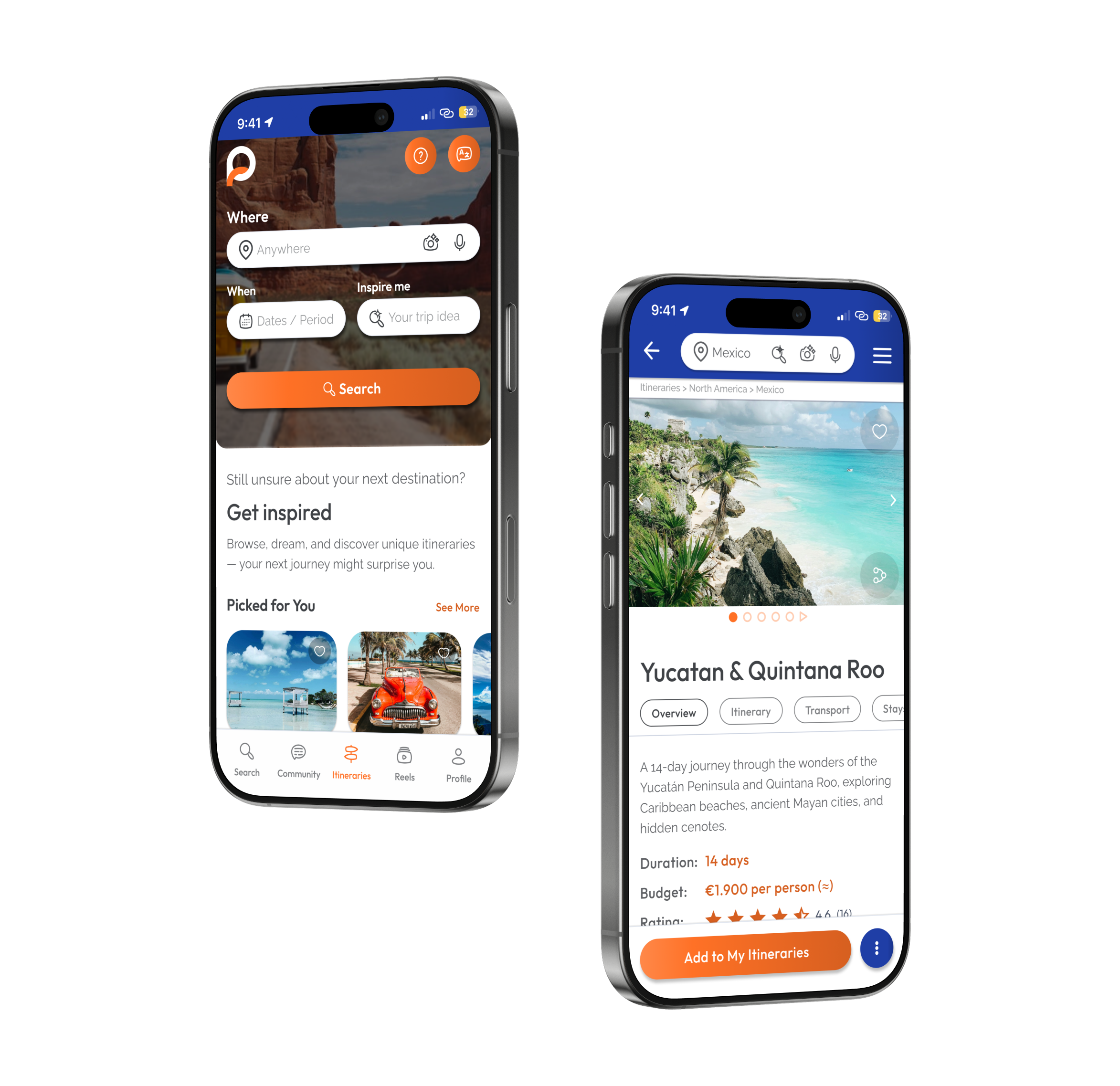

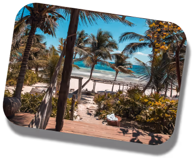
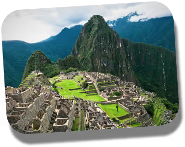
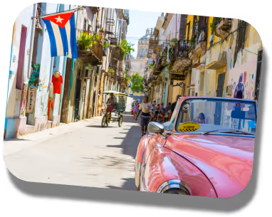
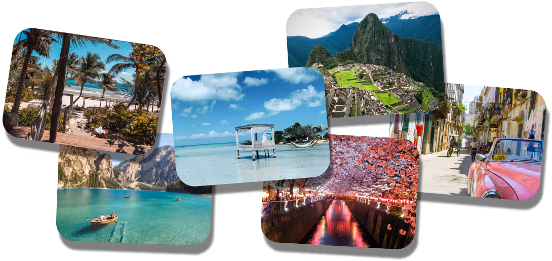
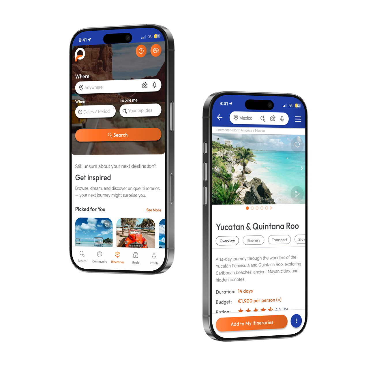
This case study documents a one-week UX/UI design challenge focused on designing the Itinerary Search & Discovery experience for a travel product.
The work covers UX reasoning, interface design, accessibility, and system-level consistency, resulting in a production-ready mobile experience supported by a scalable design system and a functional prototype.
The project was developed as part of a selection process and led to a positive outcome.
This case study documents a one-week UX/UI design challenge focused on designing the Itinerary Search & Discovery experience for a travel product.
The work covers UX reasoning, interface design, accessibility, and system-level consistency, resulting in a production-ready mobile experience supported by a scalable design system and a functional prototype.
Particular emphasis was placed on system thinking, from token-based foundations to reusable components and interaction patterns .
The project was developed as part of a selection process and led to a positive outcome.
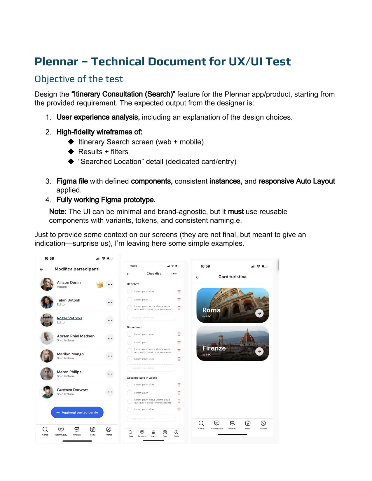
Focus areas:
The logo was not redesigned and the existing Plennar wordmark was used.
Primary and accent colors were inherited from the brand’s existing landing page.
All other visual decisions, including color usage, combinations, hierarchy, states, and system logic, were designed as part of this case study.
These constraints guided design decisions throughout the one-week challenge and provide context for evaluating the final outcome.
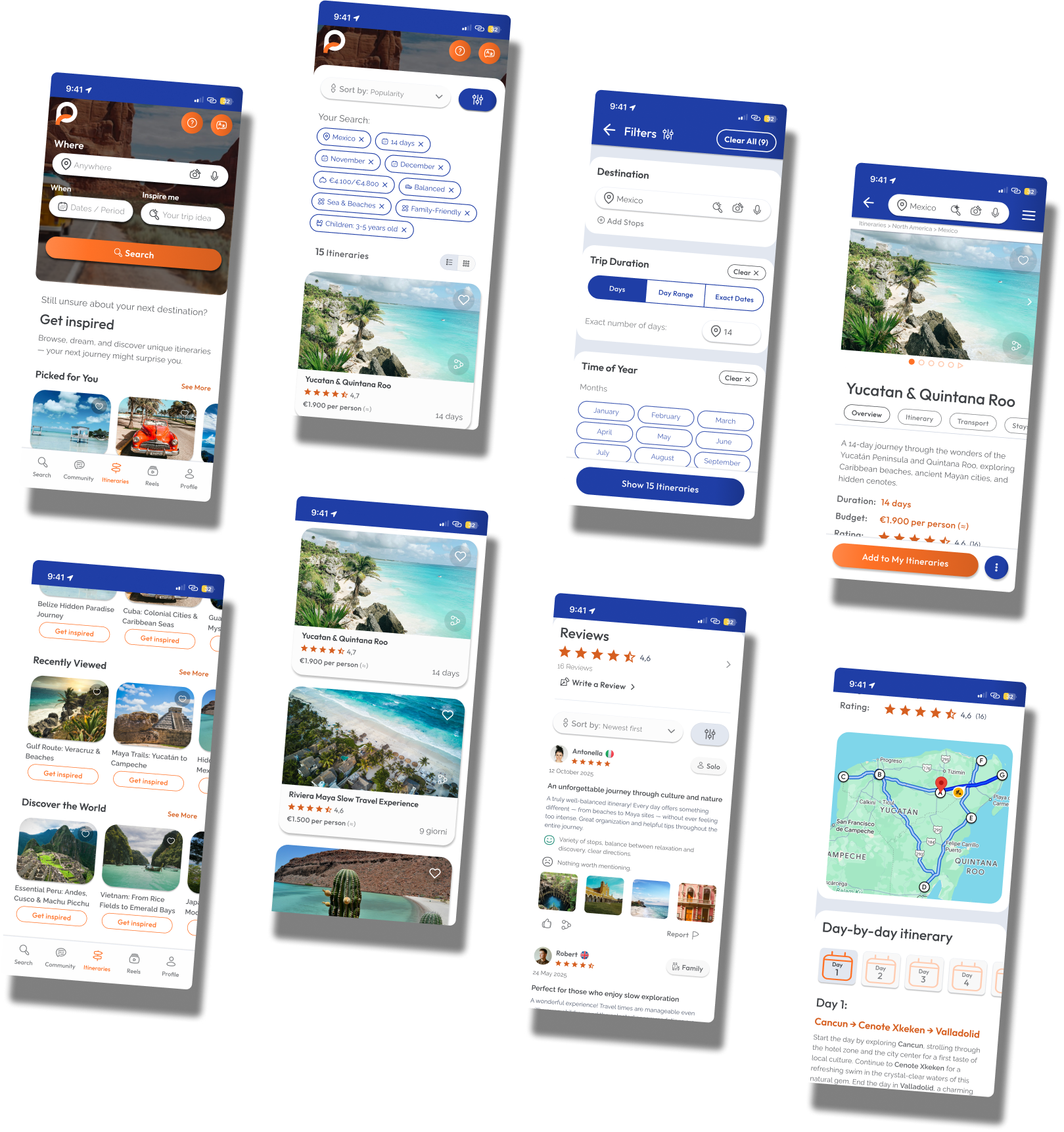
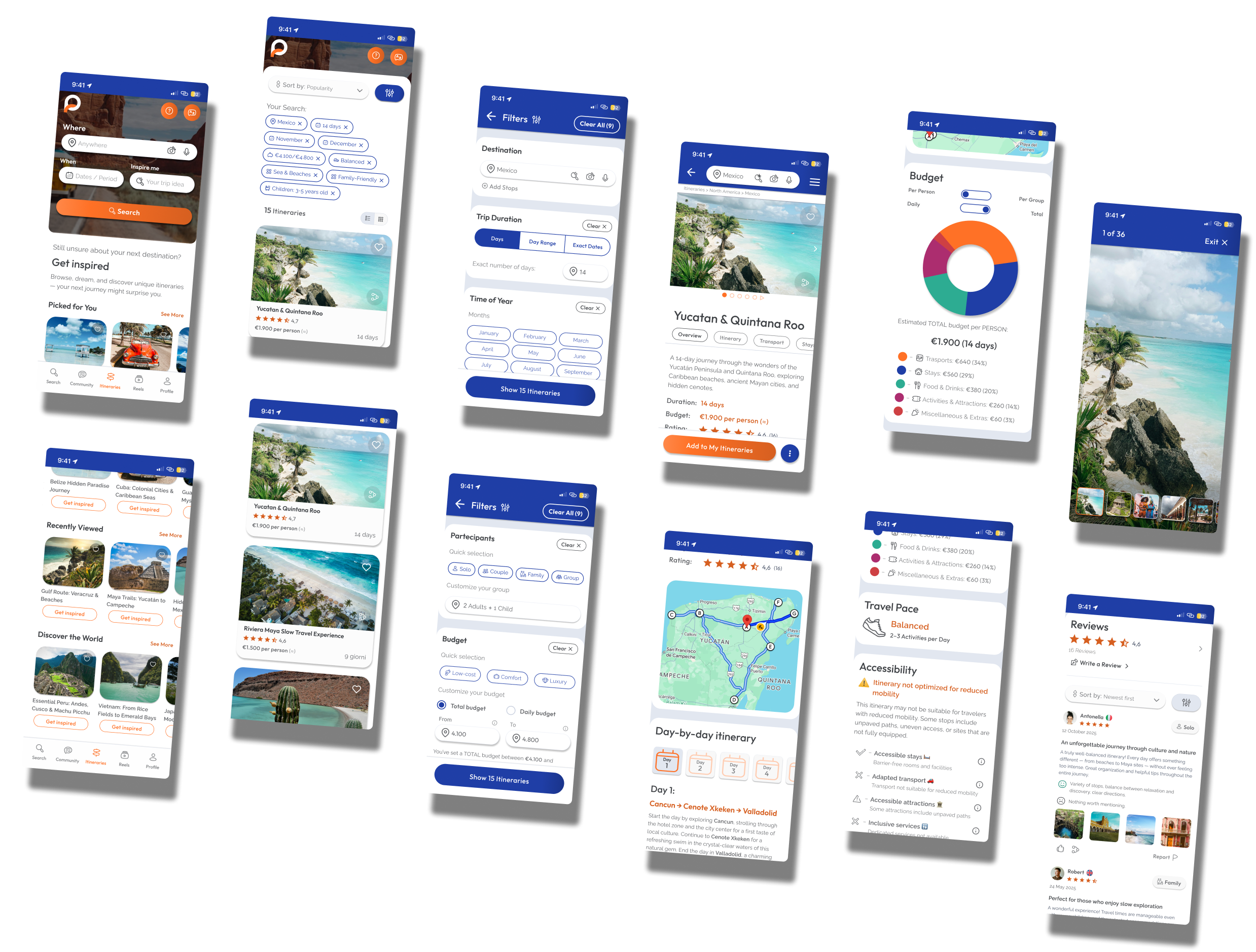
The experience was designed around a progressive filtering model, allowing users to:
Each step is documented with user actions and accessibility considerations to ensure clarity, continuity, and inclusive decision-making.
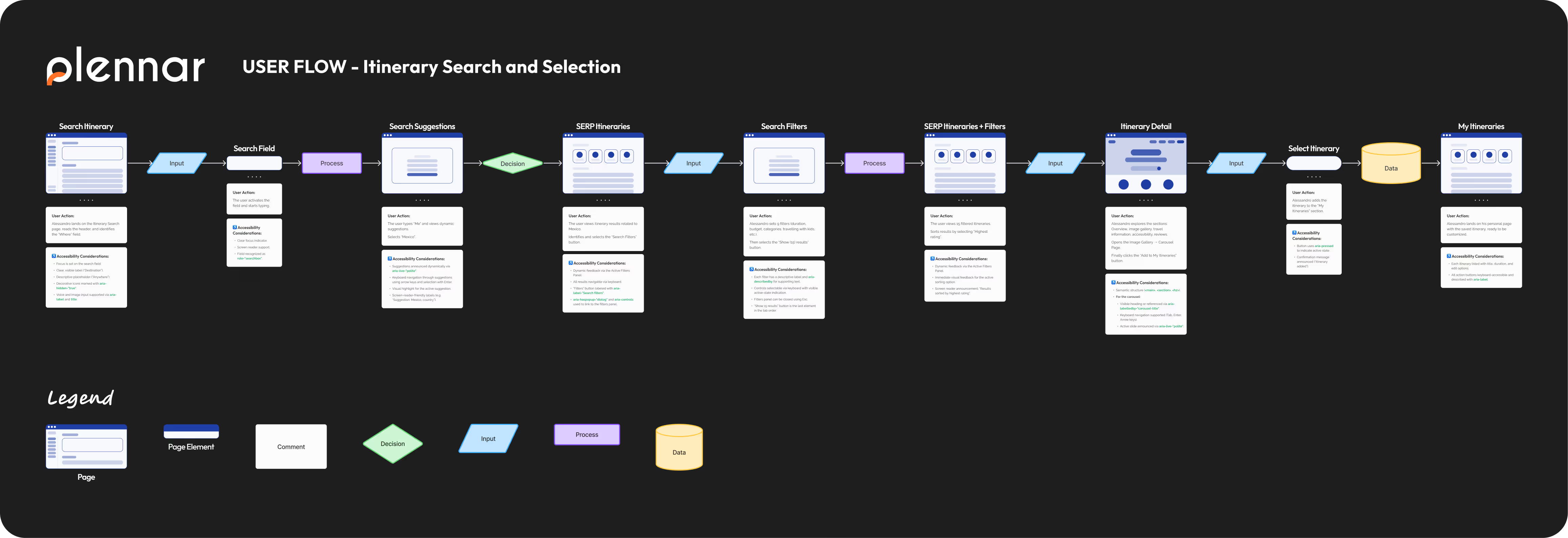
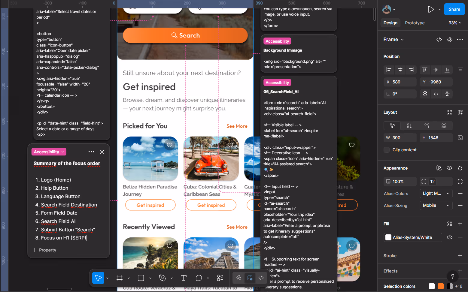
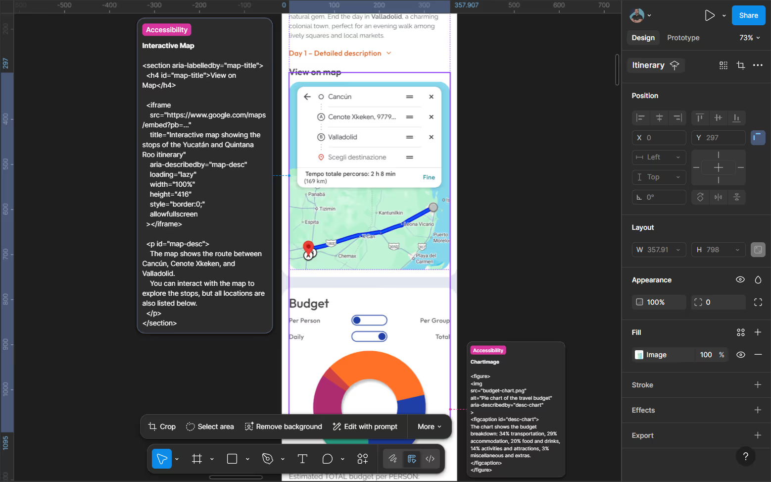
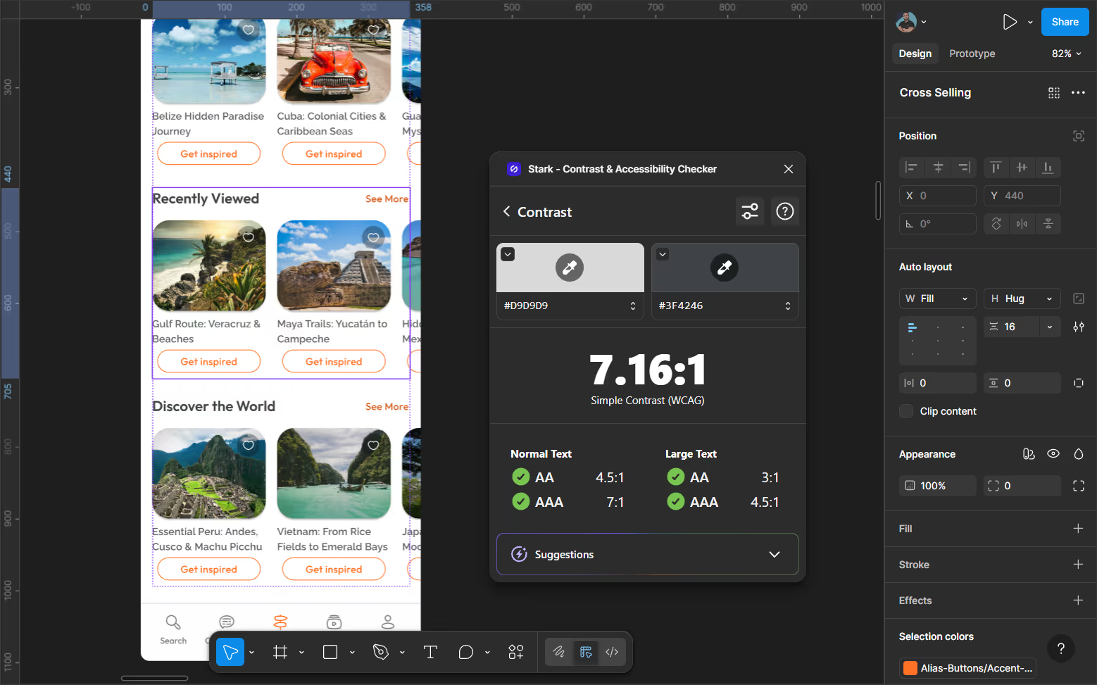
Accessibility was treated as a design requirement, not a post-design fix.
Interactive components (filters, carousels, chips, toggles) were designed with semantic structure and assistive technology behavior in mind from the early stages.
Screens highlight focus order, labeling, ARIA intent, and alternative text examples, demonstrating how accessibility was addressed from design to interaction.

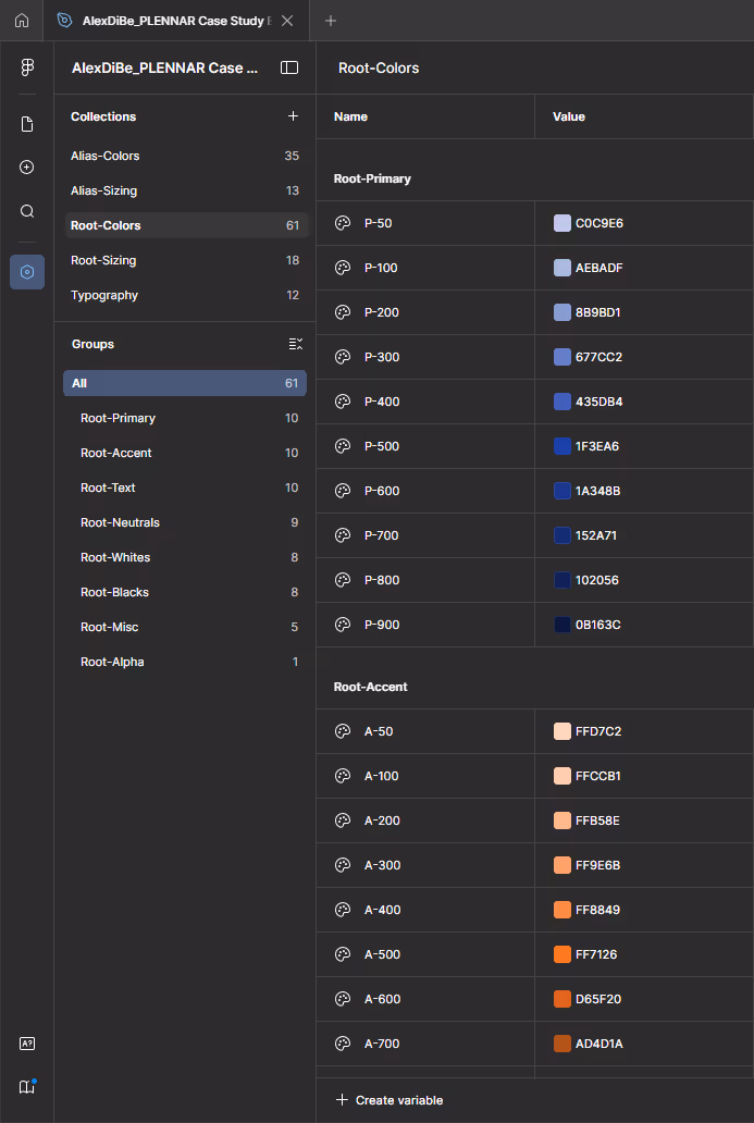
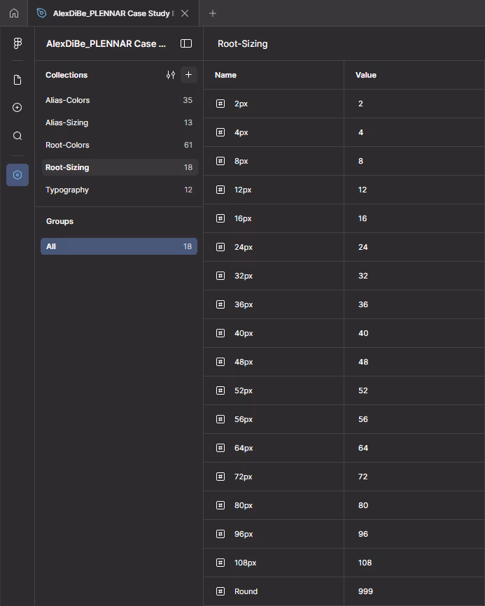
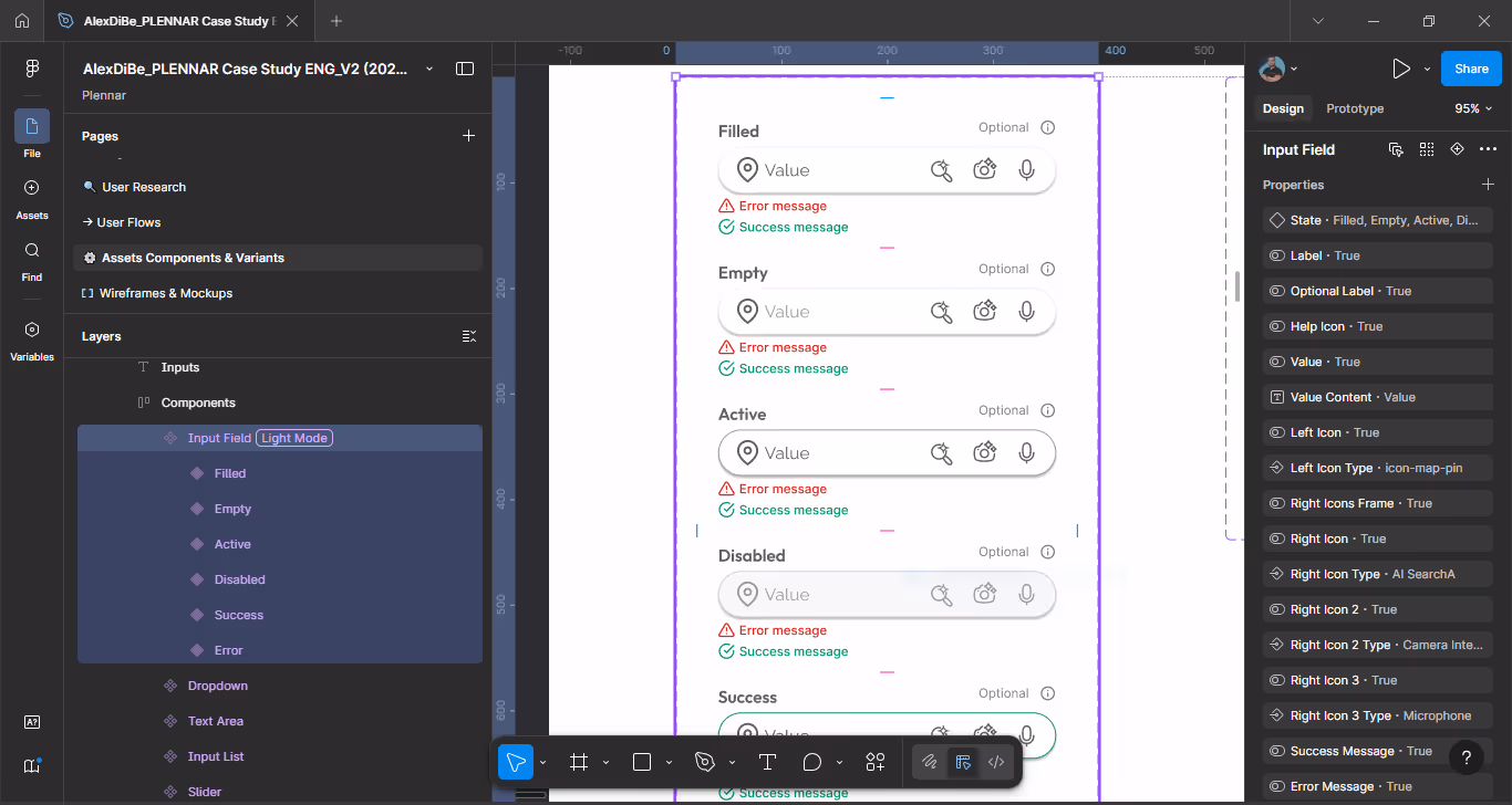
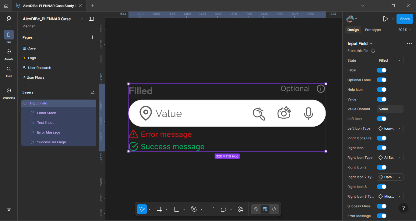
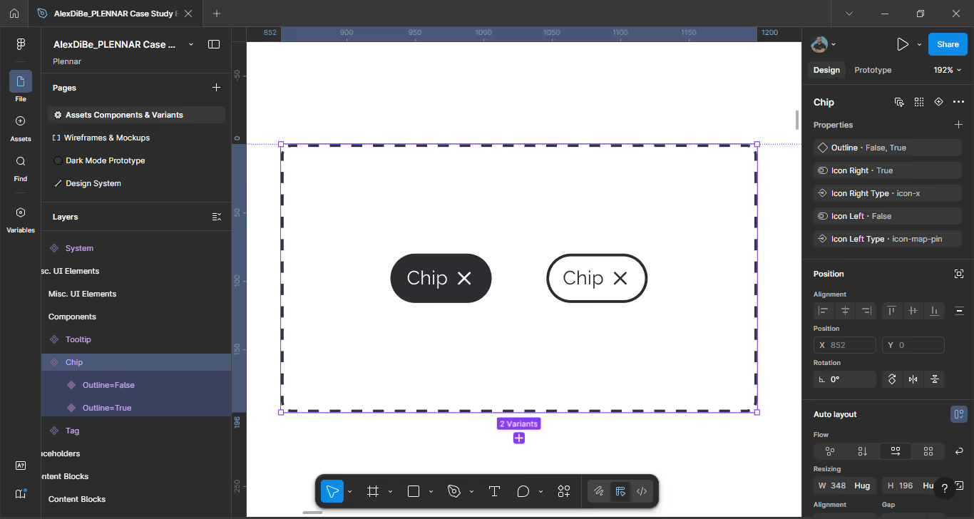
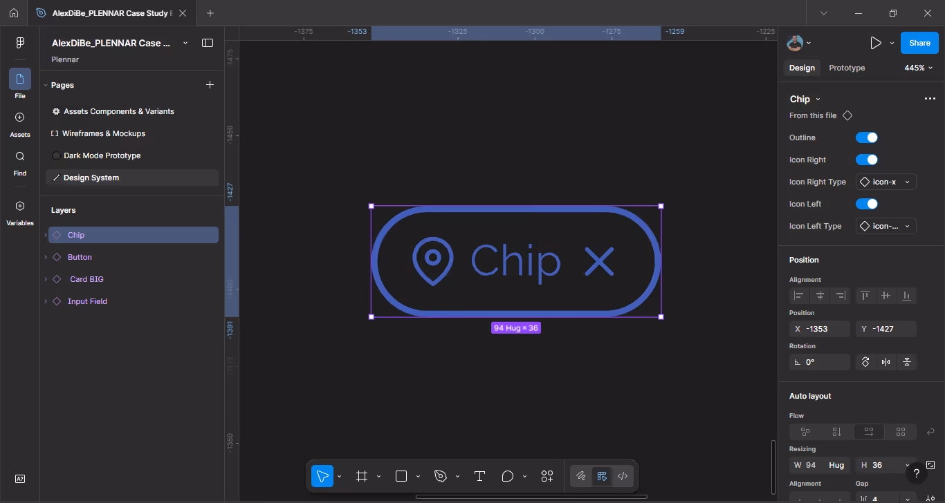
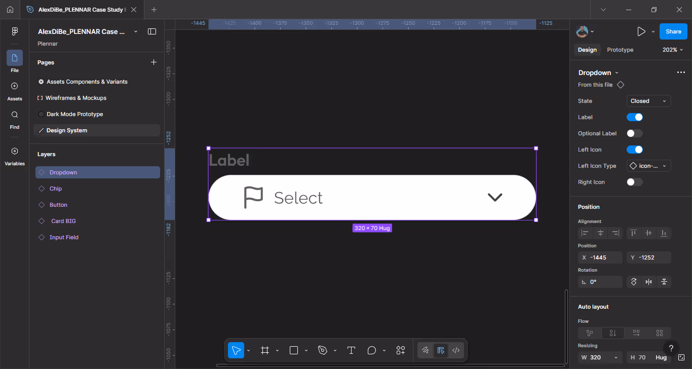
Tokenization was a core part of the design process, not an afterthought. Even within a one-week timeframe, the interface was built on a structured token system to ensure consistency, scalability, and design–development alignment from the earliest stages.
All visual decisions are mediated through tokens, enabling controlled change, predictable behavior, and easier evolution of the interface over time.
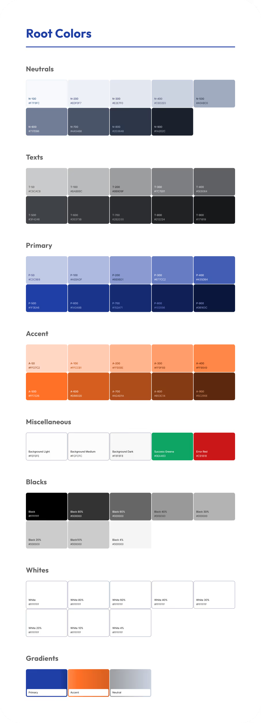
The system is based on a two-layer architecture that separates foundational values from contextual usage.
Root tokens define the single sources of truth:
These tokens represent immutable foundations and are not applied directly to components.
Named color scales and base sizing values act as single sources of truth, ensuring consistency and predictable scaling across the interface.
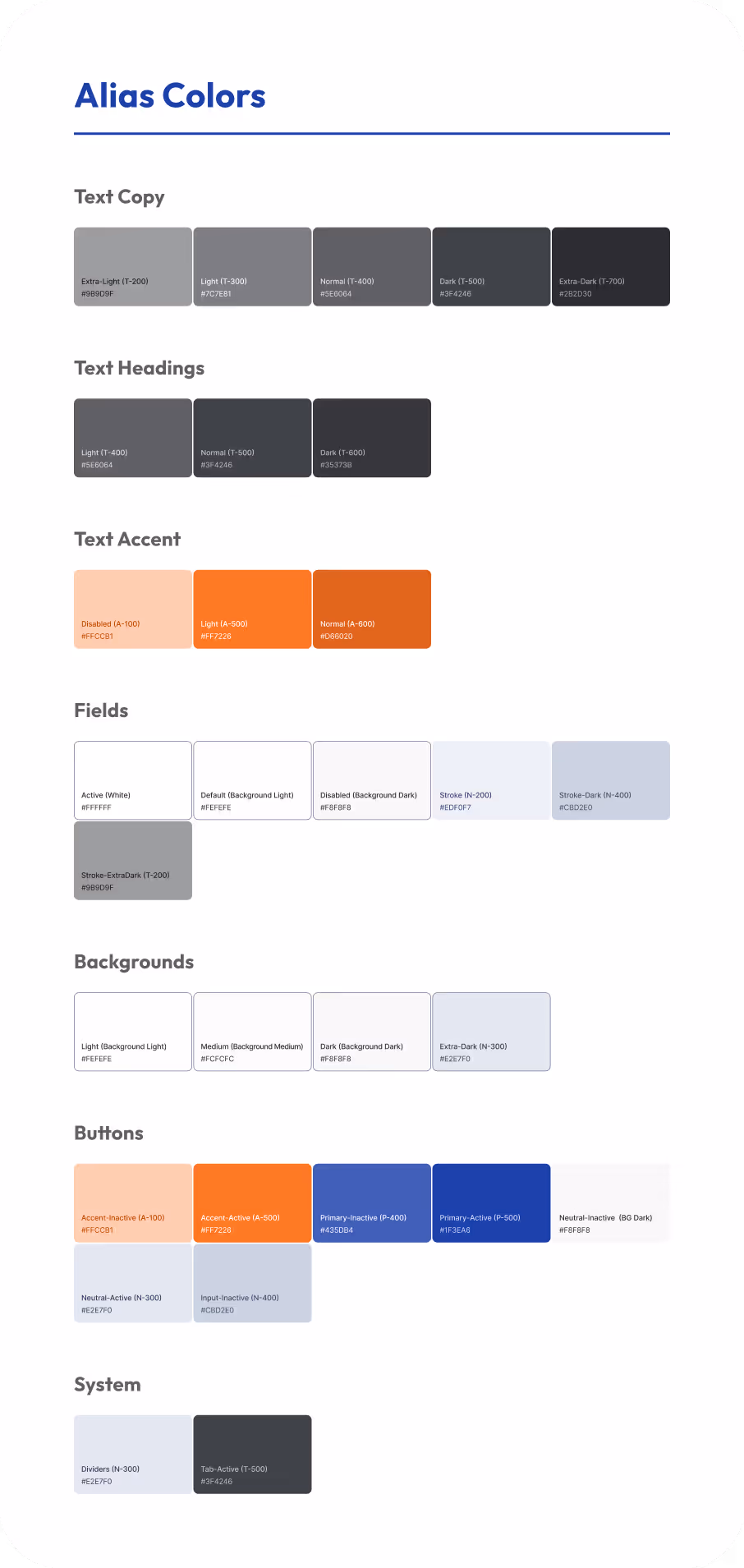
Alias tokens map root values to functional roles:
This layer allows targeted changes without breaking the system or impacting unrelated components.
This layer enables contextual usage, targeted updates, and flexible system evolution without impacting core foundations.
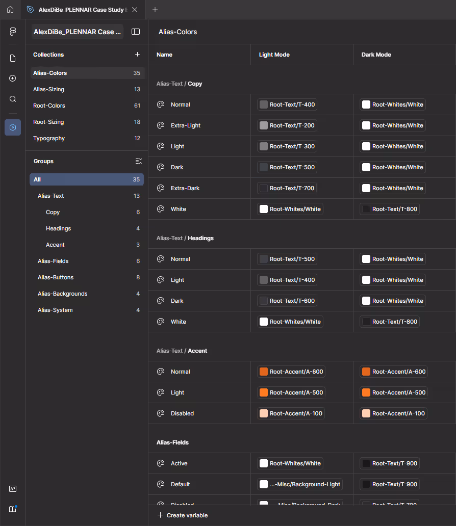
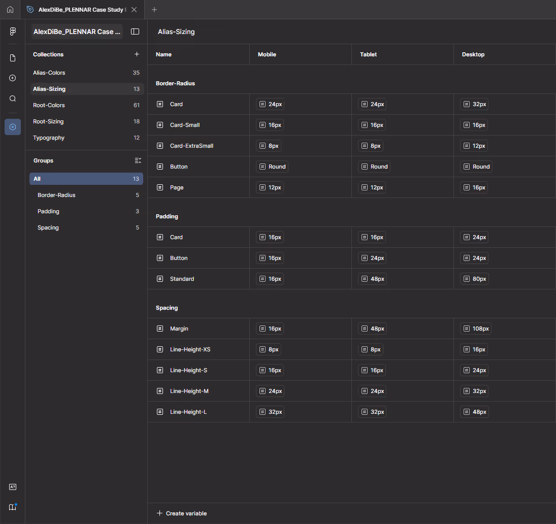
Alias tokens support multiple modes:
This structure enables the interface to adapt across devices and themes while preserving visual hierarchy and consistency.
Overall, the token system favors clarity and long-term maintainability over visual experimentation, reflecting a production-oriented mindset aligned with real product workflows.
The system adapts visual hierarchy and contrast across themes while preserving consistency and accessibility.
Given the one-week timeframe, the goal was not to build a fully exhaustive design system, but a Design System Minimal: a focused, well-structured foundation tailored to the actual screens and flows designed during the challenge.
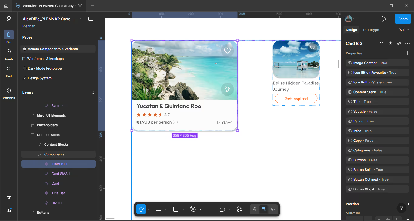
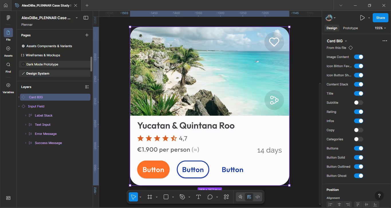
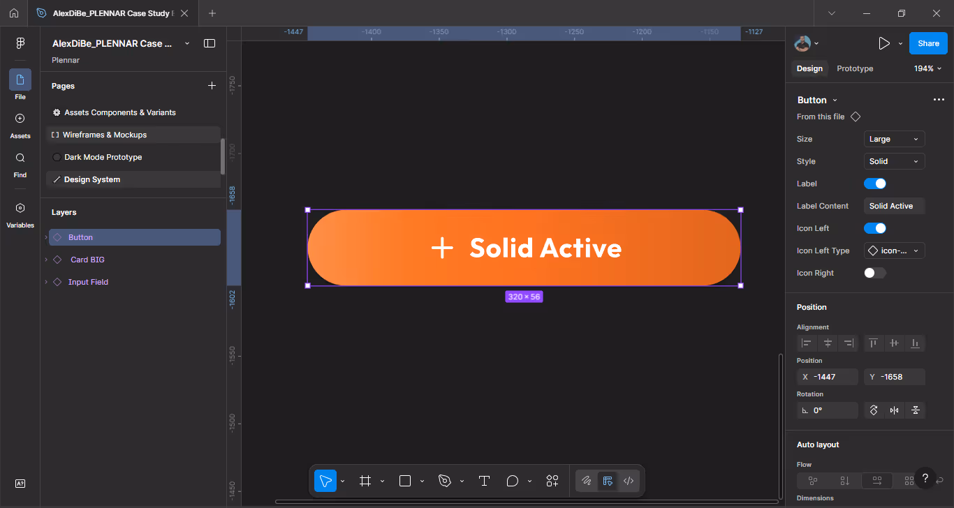
The Design System includes the core building blocks required to ensure consistency and scalability across the UI:
While minimal in scope, the system was designed with production logic in mind: components are reusable, naming is consistent, and visual decisions are intentional and traceable.
Includes core elements such as color, typography, buttons, cards, inputs, navigation, and layout grid, covering all screens designed in the project.
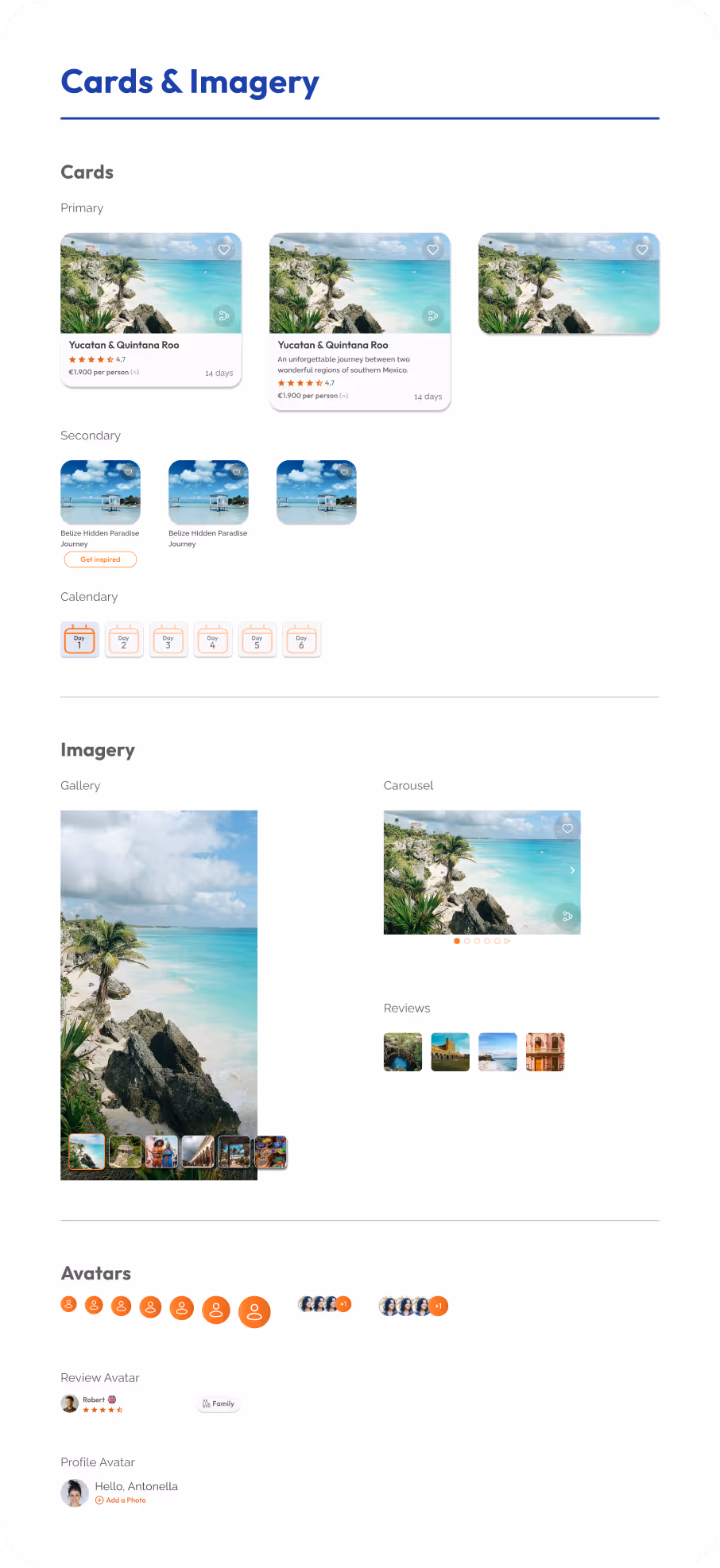
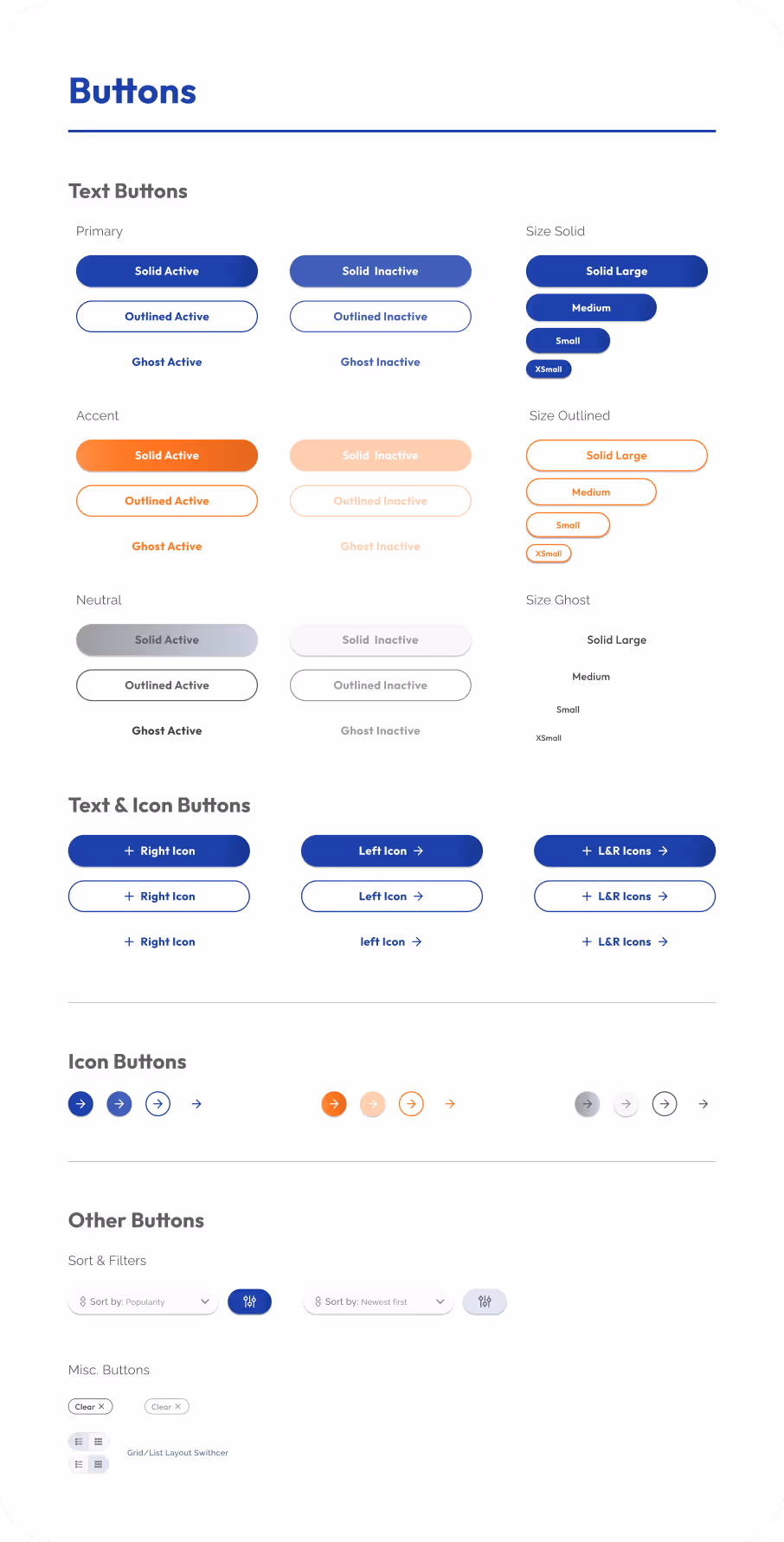
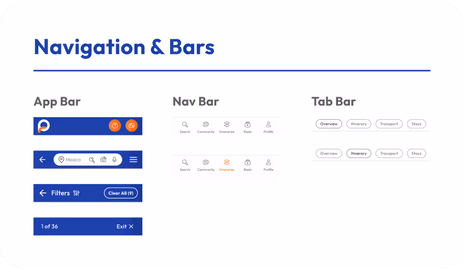

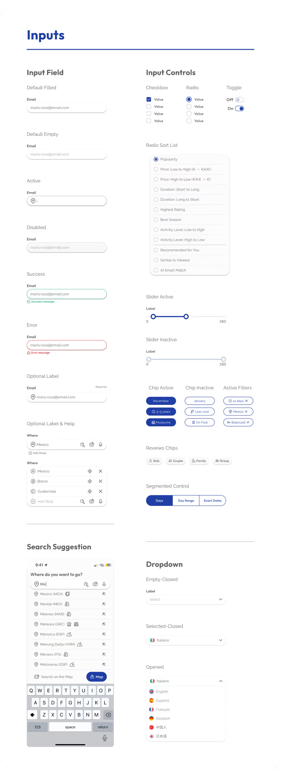
The interface is built around reusable, configurable components designed to support multiple screens and flows without repetition.
Components were structured to adapt through variants and states, allowing the same building blocks to serve different use cases while remaining consistent and easy to maintain.
This approach enables:
By focusing on flexibility and reuse, the component system supports real product needs and reinforces a production-oriented mindset, even within the constraints of a one-week challenge.
Complex variants, boolean properties, instance swaps, and variable-driven states enable efficient reuse across multiple contexts and flows.
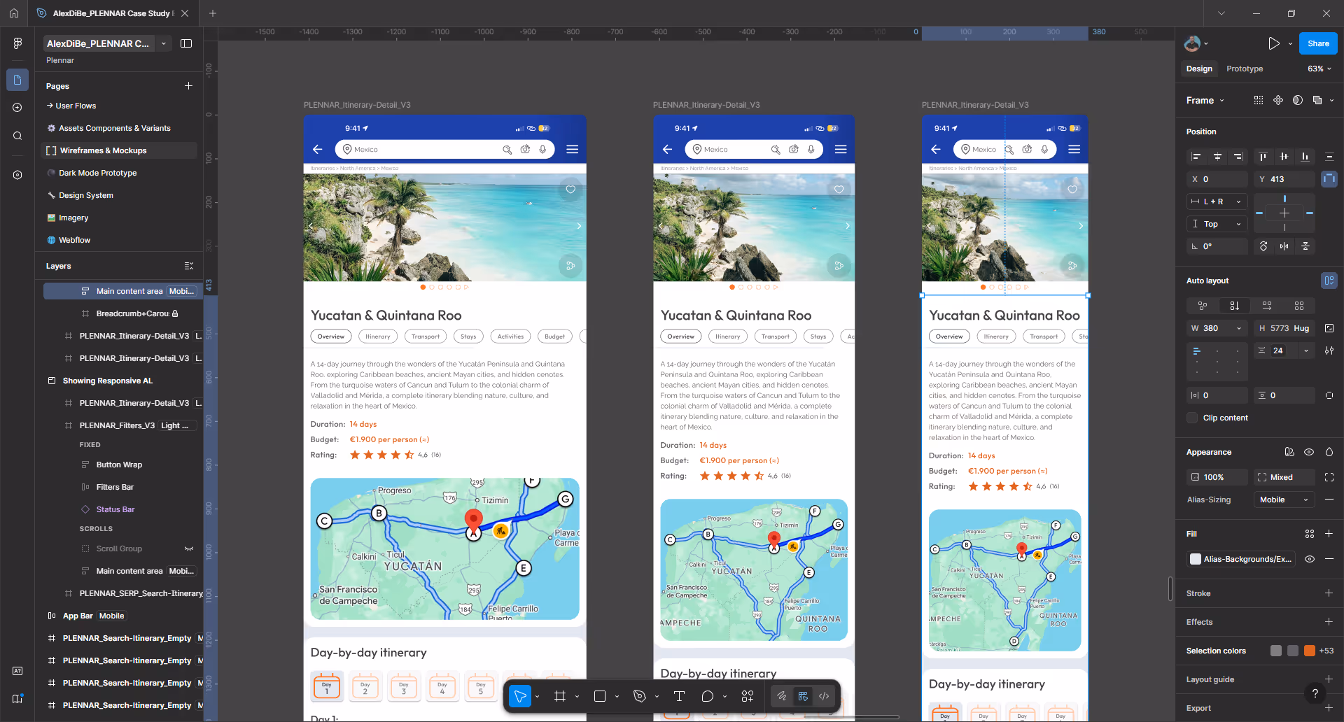
The entire UI leverages Figma Auto Layout & Constrains to ensure:
No fixed layouts were used where flexibility was required.
Screens adapt smoothly to different viewport sizes while maintaining spacing, hierarchy, and interaction consistency.
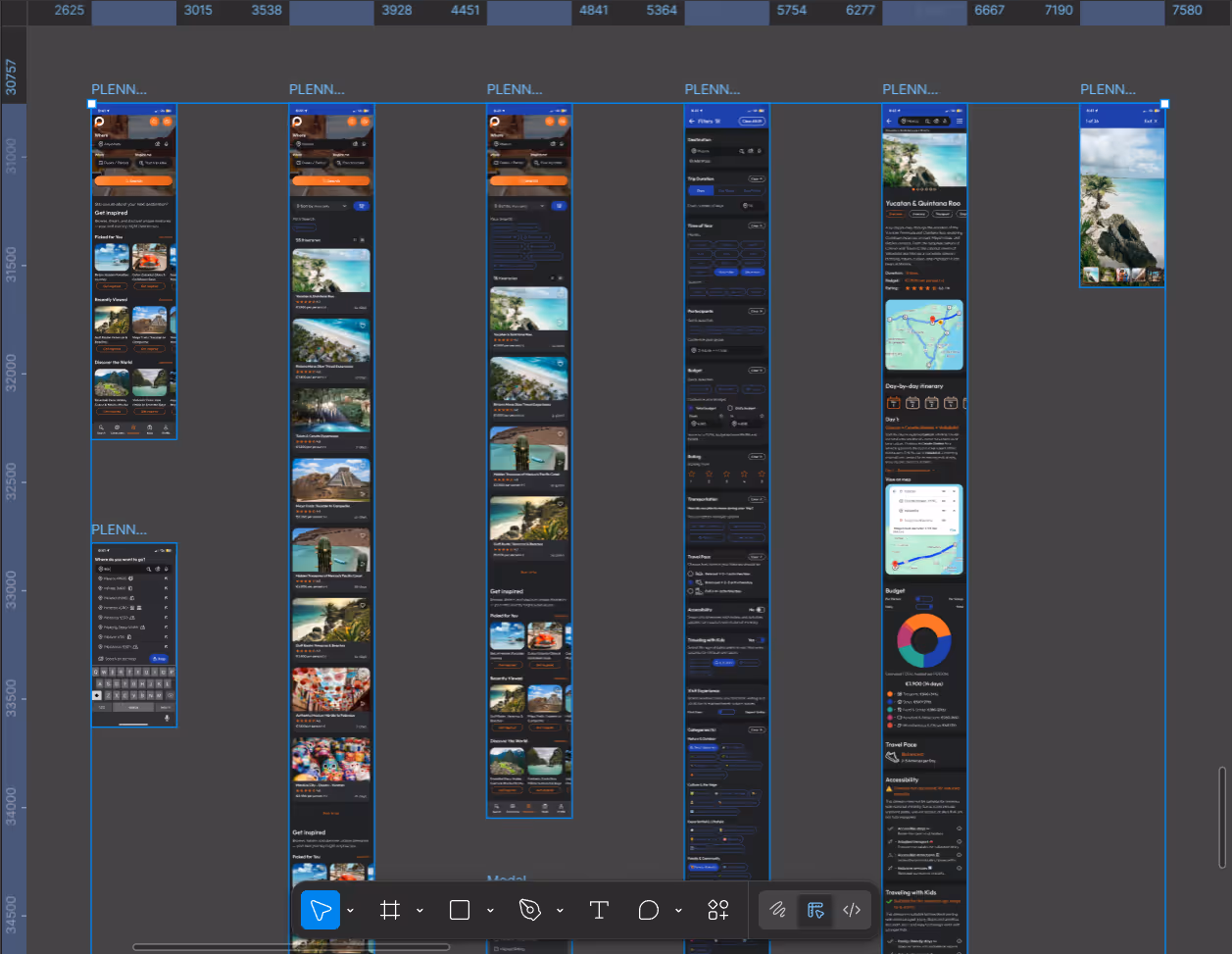
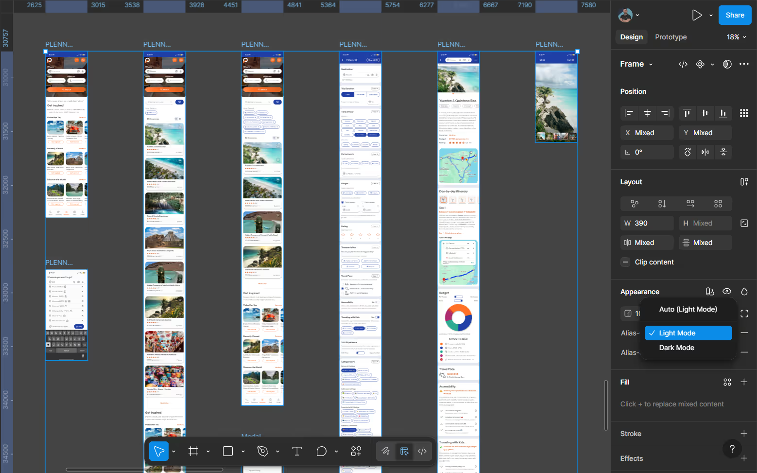
A fully navigable Figma prototype was created to simulate real user flows, validate interaction logic, and ensure visual and functional consistency across both Light and Dark modes.
Figma interactions and transitions were used to validate navigation logic, states, and overall user experience across the product journey.
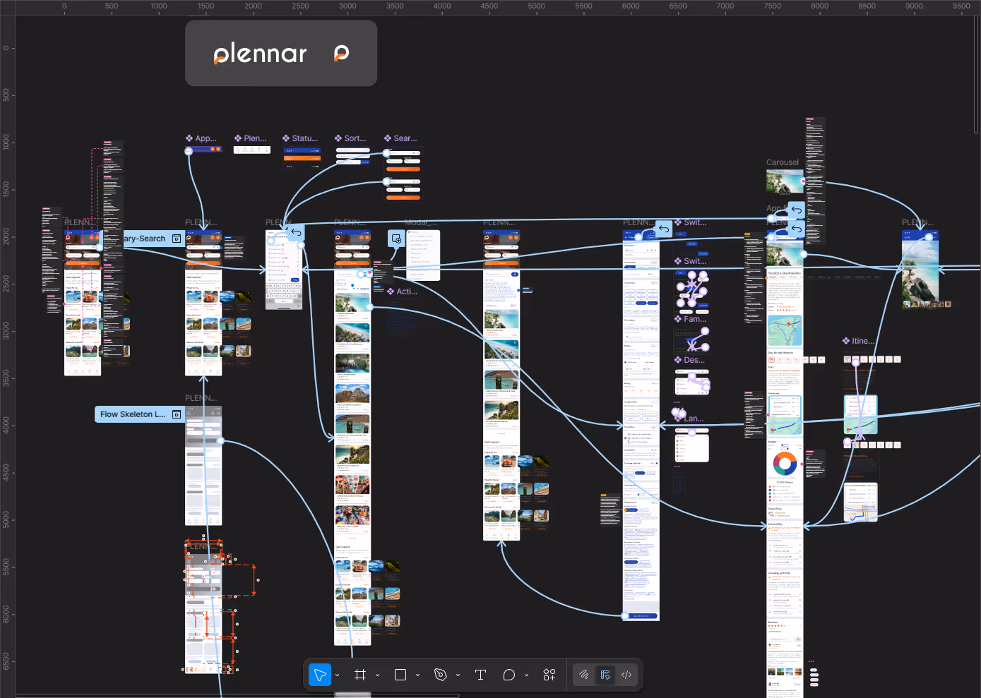
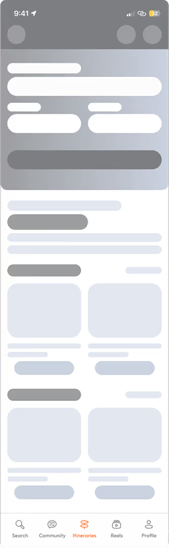
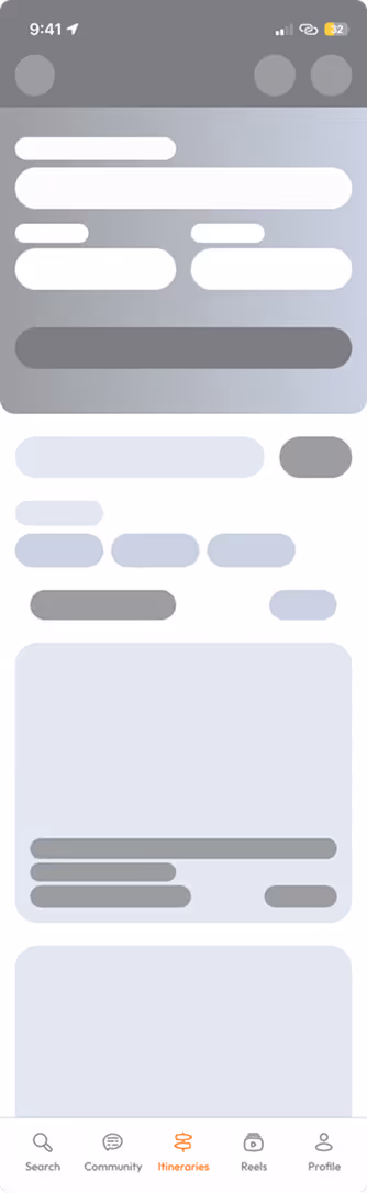
To improve perceived performance, skeleton loading states were designed for:
This ensures continuity and reduces perceived waiting time during data loading.
Itinerary search, search results, and itinerary detail; designed to preserve hierarchy, context, and perceived performance.
This project highlights:
The project successfully met the requirements of the design challenge and contributed to a positive selection outcome.