What's MyFirsThings?

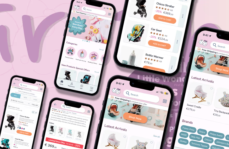
MyFirsThings is an e-commerce platform designed for buying and selling products for newborns and children up to 12 years old. It offers two main sections:

  • New Products
  • Used Products

Each section is tailored to different shopping needs, making it easy for families to find exactly what they're looking for.

In the New Products section, brands and stores can list and sell their products directly to customers, providing a seamless shopping experience with a variety of high-quality options.

The Used Products section functions as a secondhand marketplace, connecting families with specialized stores for baby and kids' items. This peer-to-peer model allows for affordable, high-quality secondhand goods to find a new home.

The Challenges

Used Products: Items for children can be pricey and often have a short lifespan as kids outgrow them quickly. Many of these products—clothes, toys, furniture, and accessories—are still in excellent condition but tend to clutter up space. These bulky items are often owned in large quantities, which makes storage and resale a challenge.

New Products: Some families prefer to invest in new, trendy, or high-quality items for their children. Their challenge is finding a platform that offers a wide selection of new products, easy comparison tools, reliable home delivery, and detailed product reviews—all in one place.

Value Proposition

For Customers/Users:

  • Find all essential baby and children's products, from clothes to toys, in one single convenient platform.
  • Choose between New or Used items based on budget and preference.
  • Easily compare similar products by price, features, and reviews.
  • Free up space at home and make money by selling items that are no longer needed.
  • Enjoy the convenience of home delivery, saving busy parents time and extra trips.
  • Rely on product reviews and ratings from other parents to make informed decisions.

For Stores/Brands:

  • Gain access to a new sales channel reaching a wider audience.
  • Reduce excess inventory by selling past collections or unsold stock.
  • Boost visibility and brand recognition through an additional, targeted platform.
User Research
Interaction Design
Visual Design
UX Writing
User Research
Interaction Design
Visual Design
UX 
Writing

User Research

Competitor Analysis

Competitor analysis involves evaluating the strengths and weaknesses of competing products to understand what works in the market and identify opportunities to improve your own product.

Explore in detail

Positioning Strategies and Growth Opportunities

Competitor analysis provides a clear view of how your product stacks up against existing market players, highlighting strengths, areas for improvement, and innovation opportunities. This process informs design strategies that address current needs while anticipating future trends.

For this analysis, I studied two main competitors:

  • Babyshop: focused on selling new children's products.
  • Vinted: a C2C platform for buying and selling second-hand items, including those for children.

This comparison offers a balanced perspective, merging the quality of new products with the sustainability of used ones to better meet market expectations.

Surveys & Interviews

Surveys and interviews are tools for gathering feedback directly from users. They provide valuable insights into user preferences, needs, and pain points, which can help improve the overall user experience.

Explore in detail

Listening to Users to Improve Design

Surveys and Interviews are essential tools for gathering direct feedback from users.

This survey included 20 parents of children under 12, who represent our primary target audience. The goal was to explore their inclination towards online shopping and their willingness to buy and sell second-hand children's items.

Inspired by Vinted's success—driven by simplicity, recycling, and the prospect of extra income—I explored these aspects and uncovered key barriers, such as the time required to create listings and the sentimental value attached to certain items.

These insights will guide the design of solutions that simplify buying and selling second-hand items, ensuring they are more aligned with user needs.

Summary

The audience shows a good inclination towards online shopping for all types of children's items and is in favor of a dedicated platform that sells both new and used materials.

Regarding new items, there is a willingness to purchase across all categories, with a slightly lower preference for items related to food and furniture.

As for used items, as expected, the main challenge will be to simplify and make the process of listing items for sale as quick and easy as possible.

Empathy Map

An Empathy Map is a tool that helps you better understand users by stepping into their shoes. It visually represents what they see, hear, think, and feel, guiding you to create more user-centered designs.

Explore in detail

Understanding User Emotions

The Empathy Map is a tool that helps empathize with users, exploring what they see, think, feel, and do when interacting with a product. This approach goes beyond surface-level analysis, delving into users' emotions and expectations for a more human and concrete understanding of their behavior.

In my work, I developed two ‘proto personas’: Valeria and Massimo, representing distinct target audiences. By analyzing them, I explored their challenges and needs, building a deeper understanding of their interactions with the product.

The Empathy Map immerses you in the user’s perspective, mapping emotions and difficulties to steer design towards genuinely user-centric solutions. This process allows for designing seamless and engaging experiences, addressing both explicit and latent needs.

User Personas

Personas are fictional profiles representing different types of target users. These profiles are based on research data and help design solutions that meet the needs of real users.

Explore in detail

A Strategic Approach

For this project, I identified 4 user personas that accurately represent the primary user segments of MyFirsThings. These personas, based on real data gathered during user research, are not just fictional characters but profiles built to deeply understand customer needs and behaviors. Working with these personas enabled me to define targeted solutions, creating a truly personalized user experience.

The profiles cover a wide range of users: parents with children aged 9 months to 10 years, with incomes ranging from €20,000 to €75,000 annually, and purchase preferences ranging from affordability to exclusivity. These four personas embody diverse but complementary needs, allowing us to cater to both budget-conscious buyers and those seeking exclusive products.

Storyboard

A storyboard is a visual representation of a user’s journey, illustrating how a person interacts with a product or service through a sequence of images or sketches.

Explore in detail

Martina’s Interaction with MyFirsThings

I created a Storyboard to visually represent Martina’s journey with MyFirsThings, highlighting the key moments of her experience. Each scene shows her goals, actions, and emotions, helping me visualize how the designed solutions fit into her daily life.

The journey starts when Martina, at her office, receives a notification on her phone from MyFirsThings. From there, the storyboard illustrates her interaction with the app, from discovering a new product to making a purchase.

This tool helped identify potential pain points and improve the user experience, making it more engaging and seamless.

The following storyboard is about the User Persona ‘Martina’,
a 40-year-old branch manager, mother of Chiara, a 4-year-old girl.

Customer Journey Map

A Customer Journey Map charts every touchpoint a user has with a product or service, from start to finish. It helps in understanding the user’s emotions, expectations, and frustrations along their journey.

Explore in detail

Tracking the User's Path

During the User Research phase, I created Customer Journey Maps (CJM) for each of the four previously identified personas. These visual tools allowed me to outline the entire user experience in detail, from the initial interaction with the product to the final stage.

The CJMs mapped out every key touchpoint, highlighting not only the actions taken but also the emotions and perceptions experienced by users at each step of their journey.

By using these maps, I was able to pinpoint moments of frustration, identify opportunities for improvement, and refine areas where the experience could be enhanced. This targeted approach helped streamline and improve overall user interaction.

The CJMs were essential for gaining a 360° view, enabling me to design solutions that aligned with user expectations.

Minimum Viable Product

A Minimum Viable Product (MVP) is a simplified version of a product that includes only the essential features. It’s launched to gather feedback from real users before proceeding with full development.

Explore in detail

Building the Foundations for Success

The Minimum Viable Product (MVP) is an initial version of the product designed to include only the essential features needed to meet a primary user need.

The main goal is to validate the idea with minimal resources, reducing risks and focusing development on the features that provide the most value.

For the MyFirsThings project, although the aim was to create a feature-rich, complete product, the MVP was crucial for identifying the core elements necessary to deliver a functional and satisfying user experience.

This process helped define the foundation on which the entire project would be built and outlined a future development roadmap, structured into three main phases: (1) MVP, (2) Continuous iterations, (3) Scaling up

MyFirsThings is an e-Commerce platform focused on buying and selling items for newborns and children (up to the age of 12), offering Two Main Sections:

  • New Products
  • Pre-Owned Products

The "New Products" section utilizes a B2C Marketplace approach, empowering specializedRetail Stores and Brands to directly sell and ship their products to customers via our platform.

The "Pre-Owned Products" section facilitates person-to-person transactions (e.g., Vinted) and sales between specialized stores dealing in used infant goods and customers (secondhand marketplace).

The MVP's goal is to offer users the ability to buy and sell children's products, both new and used, with some key features to facilitate the buying and selling experience.
MVP Features:
1 Homepage:
  • Well-defined sections for "New Products" and "Used Products."
  • Presentation of featured products with images and brief descriptions.
  • Search bar to find specific products.
  • Prominent links for "Buying Guide" and "Sell Your Products".
2 Product Details:
  • Dedicated page for each product with photos, price, and description.
  • Option to compare similar products (new and used) based on price and features.
3 Buying Guide:
  • Section with suggestions and tips for products suitable for different age groups.
  • Recommendations for specific products based on children's needs.
4 Selling Used Products:
  • Form for users to enter their used products for sale.
  • Option to upload photos and descriptions of the products.
  • Simple messaging system for negotiations between seller and buyer.
5 Reviews and Ratings:
  • Section dedicated to product reviews and ratings.
  • Option for users to leave reviews and stars based on their buying experience.
6 Registration and User Profile:
  • User account creation for managing purchases and sales.
  • User profile with purchase/sale history and saved preferences.
7 Informative Pages:
  • Additional information pages about MyFirstThings, terms of service, FAQ, contacts.
  • Guides and Manuals.

DEVELOPMENT PHASES

Phase 1 (MVP):
  • Implementation of the basic functionalities listed above.
  • Testing with a small group of users to gather feedback.
  • Optimization of the user experience based on feedback.
Phase 2 (Iterations):
  • Adding advanced features such as personalized recommendations, notifications, etc.
  • Improvements to the review and rating system.
  • Expansion of the range of products offered.
Phase 3 (Scale-up):
  • Implementation of advanced payment options and shipping.
  • Partnerships with multiple stores and brands to expand the offerings.
  • Targeted marketing to increase the user base.

Interaction Design

Heuristic Analysis

Heuristic analysis evaluates an interface against established usability principles, such as simplicity, consistency, and clarity. The goal is to identify potential usability issues.

Explore in detail

Optimizing MyFirsThings' User Experience

Before launching MyFirsThings, it was crucial to assess the usability of a reference platform. I conducted a Heuristic Analysis on Babyshop, a leading e-commerce site for children’s products. This approach allowed me to explore potential improvements for MyFirsThings, drawing insights from the strengths and weaknesses of a well-established competitor.

Using the "Web UX Checkup" method from ‘Web Usability’, I examined 10 key aspects of Babyshop’s interface, identifying solutions that could make MyFirsThings' user experience not only intuitive but also irresistible. This analysis provided clear direction on refining the design to ensure a smooth and satisfying interaction for future users.

Content Audit

A Content Audit is a thorough review of all the content on a site or app. It helps assess which content is effective, which can be improved, and what needs to be removed or updated.

Explore in detail

Content Strategy and Analysis

The content audit is a thorough analysis of all elements on a website or app, including text, images, videos, and other multimedia content. This process evaluates not only the quantity but also the quality and effectiveness of the content in meeting user needs.

For the MyFirsThings project, since it was a new creation, there wasn't yet a functioning product on which to conduct the audit. Therefore, the analysis focused on key competitors identified during the Competitor Analysis phase, specifically Babyshop and Vinted.

This strategy proved invaluable in understanding how competitors structure and organize their content, offering a two-fold benefit. On one hand, it provided inspiration where content was well-managed, allowing us to apply ideas and best practices to MyFirsThings. On the other hand, it highlighted competitors' weaknesses, giving us the opportunity to improve upon and surpass these shortcomings in our project.

Card Sorting

Card sorting is a technique used to organize information logically. Users categorize cards representing concepts or content, helping structure a site or app in a way that makes sense to them.

Explore in detail

Organizing Information for Users

Card Sorting is a technique used to organize information in a logical and intuitive way for users. In this process, participants sort and group cards representing specific concepts or content based on their perception. This method helps clearly structure the information architecture of a website or app, facilitating navigation and access to content.

To conduct the card sorting and identify categories and cards, I utilized data gathered from previous analyses, including the MVP, CJM, Content Audit, and Competitor Analysis.

During the preparation phase, given the complexity and high number of cards identified, we decided to use the Closed Card Sorting technique after a preliminary analysis. Furthermore, to better manage the research, the process was divided into two phases, ensuring a more structured and manageable approach to analyze all collected information.

Sitemap

A Sitemap is a visual map of a website’s structure.     It shows how the different pages are connected, helping to plan navigation and content organization.

Explore in detail

Organizing Information for Users

Creating a Sitemap is a critical step in the website design process. It's not just about mapping out pages but about planning a navigation structure that is clear, intuitive, and easy for users to follow.

For MyFirsThings, the sitemap played a key role as a reference point for designing the User Flows. It ensured that all user interactions made sense within the site, making every step feel natural and aligned with the overall experience. This laid the groundwork for a smooth transition from concept to execution, guiding the creation of Wireframes where the visual structure took shape.

Each navigation path was designed to help users quickly find what they need, without frustration or confusion. Additionally, it helped anticipate potential challenges, optimizing the architecture to ensure smooth navigation in the long term, even as the site grows or evolves.

User Flow

A User Flow is a representation of the steps a user takes to achieve a goal within a digital product. It helps design intuitive and seamless paths for users.

Explore in detail

Intuitive and Effective Navigation

A User Flow is a visual representation of the steps users take within a digital product to achieve a specific goal, such as making a purchase, signing up, or browsing content. It's essential for understanding how users interact with the system and the paths they follow to complete actions. Flow diagrams provide a clear overview of user journeys, highlighting key steps and identifying potential bottlenecks that could impede a smooth experience.

For MyFirsThings, I developed specific user flows for each of the four personas, using their Customer Journey Maps as a foundation. This allowed me to create personalized paths tailored to each user profile's needs and behaviors, ensuring a simple and effective interaction with the product.

Wireframes

Wireframes are simple, schematic sketches that show the basic structure of an interface. They are useful for planning the layout and arrangement of elements before moving on to visual design.

Explore in detail

The Structural Blueprint of Design

Wireframes are the skeleton of a digital product, a map that shows the layout of elements without focusing on aesthetic details. With a focus on text, images, buttons, and menus, they serve to define the structure and organization of pages.

Wireframes are a crucial tool for shaping the interface and determining how to present information in a clear and intuitive way. I was able to plan and visualize the hierarchy of elements, ensuring each piece of content had its proper place and purpose. It's like laying the foundation of a house—everything needs to be solid, functional, and well-organized, even though the final "design" comes later.

In short, Wireframes are much more than rough sketches. They’re the starting point of a creative journey, setting the stage for how users will interact with the product while leaving room for everything else to come.

Homepage

Cart

Checkout

Personal Account

Search Bar

New Product

Order Confirmation

Sell Item

SERP

Used Product

Menu

Homepage

Cart

Checkout

Personal Account

Search Bar

New Product

Order Confirmation

Sell Item

SERP

Used Product

Menu

Usability Testing 1

Usability Testing involves having real users try out a product to observe how they interact with it. This helps identify usability issues and improve the overall experience.

Explore in detail

Improving Interaction Design and User Experience

Usability Testing evaluates how real users interact with a product, identifying any problems and areas for improvement. By observing their actions on specific tasks, valuable insights are gathered to make the experience more intuitive.

For MyFirsThings, 3 participants tested wireframe prototypes on mobile devices using the Figma app, simulating a realistic user experience. The tasks tested included:

  • Purchasing a new product
  • Purchasing a used product
  • Checking the status of an order
  • Adding and reviewing items in the Wishlist
  • Free navigation

This approach revealed valuable feedback to improve interaction and optimize the design’s usability.

Visual Design

Moodboard

A Moodboard is a visual collection of images, colors, fonts, and other elements that inspire the design of a product. It helps define the overall style and mood that the design should convey.

Explore in detail

Defining the Visual Atmosphere

The Moodboard is a visual tool that gathers images, colors, textures, and fonts to represent the atmosphere and style of a project. It helps explore aesthetic directions and communicate the visual tone before creating mockups or prototypes.

For MyFirsThings, the moodboard was designed to evoke a calm, safe, and welcoming world for children, while also meeting the expectations of modern parents. The chosen colors – pastel shades of pink, turquoise, and orange – convey tranquility, freshness, and vitality. The idea was to balance a warm and inviting aesthetic with practical functionality, highlighting key themes such as comfort, sustainability, and informational support.

Style Guide

A Style Guide is a document that outlines the visual guidelines for a product, such as colors, fonts, and logos. It ensures consistency in design across all platforms.

Explore in detail

Visual Consistency and Identity

The Style Guide is a key document for ensuring visual consistency within a digital product. It sets the standards for the use of colors, typography, icons, buttons, and other graphic elements, guaranteeing a unified and recognizable experience across all platforms.

For MyFirsThings, the color palette is inspired by soft pastel shades like pink, turquoise, and orange. These colors evoke calm, freshness, and energy, creating a visually appealing environment that encourages exploration and purchasing. The goal is to convey a safe and welcoming world that meets the needs and expectations of modern parents.

The typography was chosen to emphasize clarity and readability. Sans-serif fonts feature rounded shapes without sharp edges, reinforcing the idea of a safe and friendly browsing environment. This helps make the MyFirsThings experience smoother and more comfortable for users, particularly during content exploration and interaction.

Mockups

Mockups are detailed, high-fidelity designs that represent the final appearance of a digital product. Unlike wireframes, which focus on layout and structure, mockups incorporate visual elements such as colors, typography, images, and branding.

Explore in detail

The Essence of the Final Design

Mockups represent the stage where the design truly comes to life, offering a detailed and high-fidelity preview of what the final digital product will look like. Unlike Wireframes, which focus on structure and layout, Mockups incorporate key visual elements such as colors, typography, images, and branding. This creates a realistic preview of the user interface before it moves into the development phase.

For MyFirsThings, the Mockups accurately represent the stylistic choices outlined in the Style Guide, harmoniously combining the pastel color palette, rounded typography, and custom iconography. These Mockups not only serve as a visual blueprint but also ensure that the overall interface is both aesthetically pleasing and functional.

Navigate the Interactive Prototype

"Click the top-right icon below to view the prototype in fullscreen."

Homepage

Cart

Checkout

Personal Account

User Profile

Sales

Categories

Search Bar

New Product

Order Confirmation

Sell Item

Wishlist

Subcategory

SERP

Used Product

Menu

Orders

Payments

FAQ

Contacts

Homepage

Cart

Checkout

Personal Account

User Profile

Sales

Categories

Search Bar

New Product

Order Confirmation

Sell Item

Wishlist

Subcategory

SERP

Used Product

Menu

Orders

Payments

FAQ

Contacts

Homepage

Cart

Checkout

Personal Account

User Profile

Sales

Categories

Search Bar

New Product

Order Confirmation

Sell Item

Wishlist

Subcategory

SERP

Used Product

Menu

Orders

Payments

FAQ

Contacts

UI Kit

A UI Kit is a collection of predefined user interface components, such as buttons, forms, and icons. It helps create cohesive and well-designed interfaces while speeding up the design process.

Explore in detail

Ensuring Consistency and Speeding Up Development

A UI Kit is a collection of predefined visual components like buttons, input fields, icons, and menus. These reusable and customizable elements help maintain visual and functional consistency, reduce development time, and allow designers to focus on optimizing the user experience.

For MyFirsThings, I developed a UI Kit divided into 10 key areas: Colors, Typography, Buttons, Icons, Illustrations, Cards, Images, Navigation, Inputs, and Miscellaneous Elements. Each area was designed to ensure maximum consistency and ease of use, enabling smooth and intuitive navigation.

Organizing these elements into well-defined categories streamlined the design process, allowing for quick iterations while keeping the visual identity consistent across all pages and devices. This approach made it easier to translate the design into a functional, user-friendly interface, accelerating product delivery without compromising on visual quality.

UX Writing

Content Guide

A Content Guide provides rules and guidelines for creating consistent, high-quality content within a digital product. It helps maintain a uniform tone and style throughout the site or app.

Explore in detail

Communicating with Clarity and Consistency

The Content Guide for MyFirsThings defines how to structure texts and content, establishing tone, voice, style, and grammar rules to ensure consistency and clarity across all platforms. It’s an essential tool to ensure that every message reflects the brand’s identity uniformly and is easily understood by users.

The guide was designed to create an engaging and reassuring browsing experience. We chose a tone that combines the care of a parent with the authority of a trusted advisor. The result is clear and captivating communication that guides users, making the site intuitive and welcoming as they search for the best products for their children.

This linguistic consistency not only strengthens the brand identity but also helps users feel confident and supported throughout the browsing and purchasing process.

Usability Testing 2

Usability Testing involves having real users try out a product to observe how they interact with it. This helps identify usability issues and improve the overall experience.

Explore in detail

Enhancing the Experience with UX Writing

After the first phase focused on Interaction Design, I engaged the same participants in a second session dedicated to UX Writing.

This phase focused on texts and interface elements, assessing the effectiveness of labels, messages, and communications. The test helped to understand how well the words used facilitated navigation and met user expectations, improving accessibility and clarity.

The tasks tesed included:

  • Identify and use Search Filters
  • Explore the FAQs
  • Interact with Pop-ups and Modals
  • Interact with Button Labels and Main Menu
  • Explore Contact Information
  • Change the App Access Password

Microcopy

Microcopy refers to the creation of concise, clear text that effectively communicates the message to the user without being too wordy. This type of writing is essential for improving usability.

Explore in detail

Crafting Concise Texts for Better Usability

Microcopy refers to the creation of short, clear, and direct texts that communicate important information to users quickly and effectively. In the fast-paced digital world, where attention spans are limited and decisions are made in seconds, well-crafted microcopy plays a critical role.

By focusing on clarity and brevity, microcopy enhances the overall usability of a product, ensuring users can interact seamlessly with the interface. The right words in the right place not only improve the user experience but also help reduce cognitive load, making interactions smoother and more intuitive. Ultimately, effective microcopy is key to improving user satisfaction and ensuring the product is as efficient as possible.